financial clarity for hoas
Fintech ui/ux • Data Visualization • Payment Tracking • Dynamic Tables

About
Role
In 2022, I joined Dials as a Founding Product Designer, leading the design of a streamlined bookkeeping experience for HOAs. As the sole designer on a $300K seed-funded project, I drove end-to-end design execution, resulting in 100+ sign-ups and adoption by multiple HOAs, each with 10+ homeowners actively using the platform.
Collaborating closely with the co-founders, who brought expertise in robotics and were also former colleagues, I gained insight into their vision. They described the product as “Gusto for property managers”, emphasizing its role in streamlining financial management for HOA communities.

Half the Market, Full of Potential
The HOA industry represents over $100 billion in annual spending, with 40+ million units belonging to HOA organizations nationwide. Of these, nearly 50% are independently managed, often without adequate support. Our goal was to capture this underserved segment by offering an affordable, easy-to-use, and lightweight software solution tailored for independent managers—providing just the essential tools they need to streamline their work efficiently.

Breaking Down the Competition
Before doing any design work, I conducted a competitive analysis of existing HOA software, mapping out key features, pricing, and target users. Most platforms catered to large-scale property management companies, making them overly complex and expensive for small, independent HOAs. Our solution stood out by focusing on simplicity and affordability, offering an intuitive, streamlined experience tailored specifically for smaller communities that needed an easy-to-use and cost-effective bookkeeping tool.

Face-to-Face with HOA Leaders
I took a trip to California to meet with HOA managers— learning that independent HOAs are caught in a tough spot—they’re too small to afford management companies, whose services and software are often too expensive and complex, yet too large to be efficiently managed by just a few people. They need a simple, middle-ground solution that covers the bare essentials of accounting, such as creating expenses, tracking payments, and managing repairs, without unnecessary complexity.

From Dues to Done
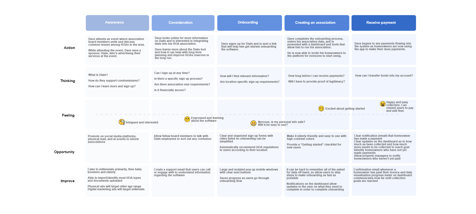
When I returned home from my trip, I analyzed key insights from user interviews, identifying common pain points, goals, and behaviors related to the study. I then created a user journey map that outlined the entire process—from initial awareness to the moment an HOA manager sees money flowing through the system—capturing the experience from start to finish.

Designing the Framework
I used sitemaps to map out where each product would fit within the overall application, providing a clear structure and hierarchy. This gave developers a comprehensive view of the information architecture, ensuring better context and alignment across the platform.
.png)
From Sign-Up to Success
One of the key user experiences I designed was the onboarding process, aimed at collecting just enough information to allow users to start using the application quickly and seamlessly.To refine this experience, I used flowcharts to map out the process, helping to visualize user interactions and streamline decision-making throughout development.

Simplifying Assessments
Another key user experience I designed focused on enabling property managers to create custom fees for groups of homeowners to cover the costs of maintaining and managing shared spaces—also known as Assessments. These assessments are added to a homeowner’s monthly dues statement, impacting the total amount owed. Recognizing widespread confusion around this process, we saw an opportunity to simplify and clarify it—prompting me to write a blog post explaining how HOAs set aside funds, known as reserves, through assessments to cover large, long-term, or unexpected future expenses. A standout aspect of this feature was its ability to batch invoice groups of homeowners, even if they were on different payment plans—a significant competitive advantage. By implementing this solution, we reduced what was previously tens of hours of manual work per month to just minutes, dramatically improving efficiency for property managers.
.jpg)
Advocating for Impact
I invited early adopters to test the prototype, providing a "Getting Started" checklist to guide their experience. Throughout the process, I captured their feedback to gain deeper insights. Noticing friction in the user journey, I recommended a stepper UX to my team to simplify complex actions, enhance intuitiveness, and reduce cognitive overload.

All Your Members, Zero Hassle

📢 Enable board to easily manage members and send targeted messages for urgent updates.
☑️ Allows multi-selection of rows to dive deeper into specifics within table.
✏️ Add or edit member information or export to third-party source for seamless integration.
➕ Visualize transaction quantity (left Y-axis, white) and transaction value (right Y-axis, teal) over a time period (X-axis) for comparative analysis.
💵Easily input one-time transactions using the teal action button in the top right.
↕️Enables sorting and deep-diving into transaction IDs to view detailed information on specific transactions.

Work Smarter, Live Fuller
Being a property manager is often a thankless job, driven more by dedication to the community than personal gain. Throughout this project, I discovered that reaching property managers could be challenging—many are older or infrequent email users, making communication difficult. It was a valuable learning experience that deepened my understanding of their unique needs and day-to-day realities. Thanks for stopping by!

.png)
.png)
.png)